
Distinctive packaging can evolve beyond shelf appeal, creating lasting brand recognition through consistency, structure, colour and visual identity.
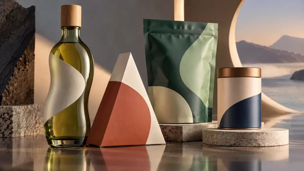
Packaging can become more than a container
Packaging is often evaluated according to its ability to attract attention on crowded retail shelves, but its strategic value can extend much further. When distinctive design elements remain consistent over time, packaging can become a recognisable brand asset that consumers identify even without seeing the company name or logo.
Radhika Dhuru, Executive Creative Director at Open Strategy & Design, argues that the strongest packaging systems are those capable of moving beyond their physical format and becoming embedded in consumer memory. Rather than focusing exclusively on making a pack appear new or visually louder, brands can benefit from building distinctive visual codes that remain recognisable across different environments and communications.
Consistency can turn packaging into an icon
Long-term consistency is one of the strongest factors behind packaging recognition. Brands frequently feel pressure to redesign or modernise their packaging, but continuous changes can weaken visual memory if distinctive elements disappear in the process.
Parle-G provides one example of how a relatively simple packaging design can become culturally significant through decades of consistency. Toblerone demonstrates the same principle through structure, with its triangular format becoming one of the most recognisable shapes in the confectionery category.
In both cases, recognition has been built not simply through graphic complexity but through repeated exposure to stable and distinctive characteristics.
Packaging assets can migrate into wider communication
A strong packaging identity can also extend into advertising, digital communication and other brand touchpoints. When consumers recognise particular colours, typography, shapes or materials without needing to see a logo, packaging has effectively become part of the wider brand language.
Coca-Cola's contour bottle illustrates how a packaging silhouette can work independently as a recognisable visual symbol. Indian beverage brand Paper Boat has similarly extended the nostalgic and handmade aesthetic of its packaging into its broader advertising and animated content.
This consistency between packaging and communication can strengthen brand recall by ensuring that consumers encounter the same visual language across multiple channels.
Recognition outside the retail shelf also matters
Packaging and product design can become especially valuable when they remain identifiable after leaving the store. Distinctive forms and colour systems can help products stand out in everyday environments where competing branding is less structured than on a retail shelf.
Luggage brand Mokobara, for example, uses characteristic forms and colour palettes to make its products easier to recognise on airport baggage carousels and in travel-related content. In this context, the physical product effectively becomes a mobile communication asset.
Brands can build flexible visual worlds
Newer companies do not necessarily need decades of history to create strong packaging recognition. Instead, they can develop flexible visual systems that allow distinctive elements to move consistently across different products and media.
The Whole Truth has built recognition around bold typography, while Slurrp Farm uses illustrated characters that can move from cereal packaging into activity materials and digital content without losing their identity.
The broader lesson is that effective packaging design should not be judged solely by its ability to generate immediate attention. Shapes, typography, colours, illustrations and structural elements can become valuable intellectual and commercial assets when they are distinctive enough to trigger recognition and consistent enough to build memory over time.









Comments (0)