
Landor redesigns Häagen-Dazs ice cream stick packaging with richer textures, premium typography and stronger visual recognition.
Häagen-Dazs puts taste and texture at the centre of packaging
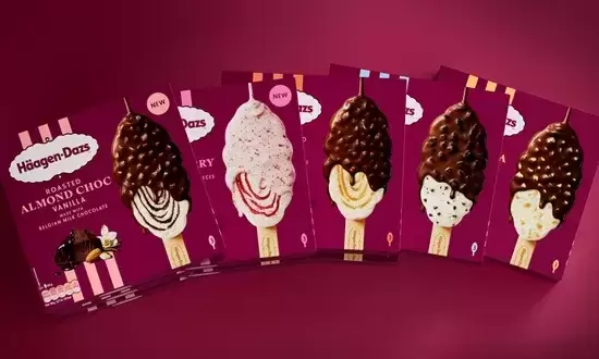
Häagen-Dazs has introduced redesigned packaging for its ice cream stick range in France and the UK, with Landor developing a new visual system intended to communicate indulgence, texture and product quality more directly on shelf.
The redesign moves away from familiar category conventions based around cracked or bitten chocolate coatings. Instead, the packaging focuses on the appearance of the complete product before consumption, using richer visual cues to highlight the creamy ice cream, generous inclusions and Belgian chocolate coating.
The objective is to make the sensory qualities of the product more immediate while strengthening recognition across a highly competitive frozen dessert category.
Chocolate coating becomes the main visual cue
One of the most significant changes is the treatment of the chocolate surrounding the ice cream stick.
Rather than presenting chocolate primarily through broken or cracked surfaces, Landor has developed a more fluid and textural visual expression, designed to make the coating appear thicker and more generous.
This approach places the product itself at the centre of the pack and aims to communicate richness before consumers open the packaging.
Burgundy strengthens Häagen-Dazs brand recognition
The redesign also makes greater use of the deep burgundy associated with Häagen-Dazs, extending the colour across the complete pack to create a more consistent and premium visual presence.
A dedicated product photography shoot was developed against this background, allowing ingredients and textures to stand out while reinforcing a recognisable brand colour across the range.
The increased use of burgundy also provides a stable visual framework across different flavours and formats.
New visual codes organise the product range
Landor has introduced several additional elements to improve navigation and differentiation between SKUs.
Premium typography is used for flavour names, while vertical stripes create a consistent structural device across the range. The packs have also been simplified to give more space to product photography and ingredient cues.
A proprietary ice cream silhouette, inspired by the shape of the Häagen-Dazs logo, adds another distinctive design asset that can help consumers recognise the range independently of individual flavour graphics.
Packaging becomes the first expression of indulgence
The project reflects a broader shift in FMCG packaging towards stronger sensory communication, where design is expected to convey not only product information but also taste, texture and consumption experience.
For premium food brands, this is particularly important in categories where consumers make rapid choices based on visual appetite appeal and perceived quality.
By combining stronger brand codes with more expressive product imagery, Häagen-Dazs is using packaging to reinforce its premium positioning before the product itself is experienced.
Design consistency supports long-term brand equity
The redesign also illustrates how individual packaging elements can become reusable brand assets rather than temporary decorative features.
Colour, typography, layout and product silhouette can all contribute to recognition when applied consistently across multiple SKUs and markets.
For Häagen-Dazs, the updated ice cream stick packaging therefore goes beyond a visual refresh, creating a more structured identity system designed to improve shelf impact while reinforcing the sensory and premium qualities associated with the brand.








Comments (0)