
Presentable’s Vial concept uses modular graphics and daily tracking features to turn supplement packaging into a functional wellness routine.
Vial rethinks the visual language of supplement packaging
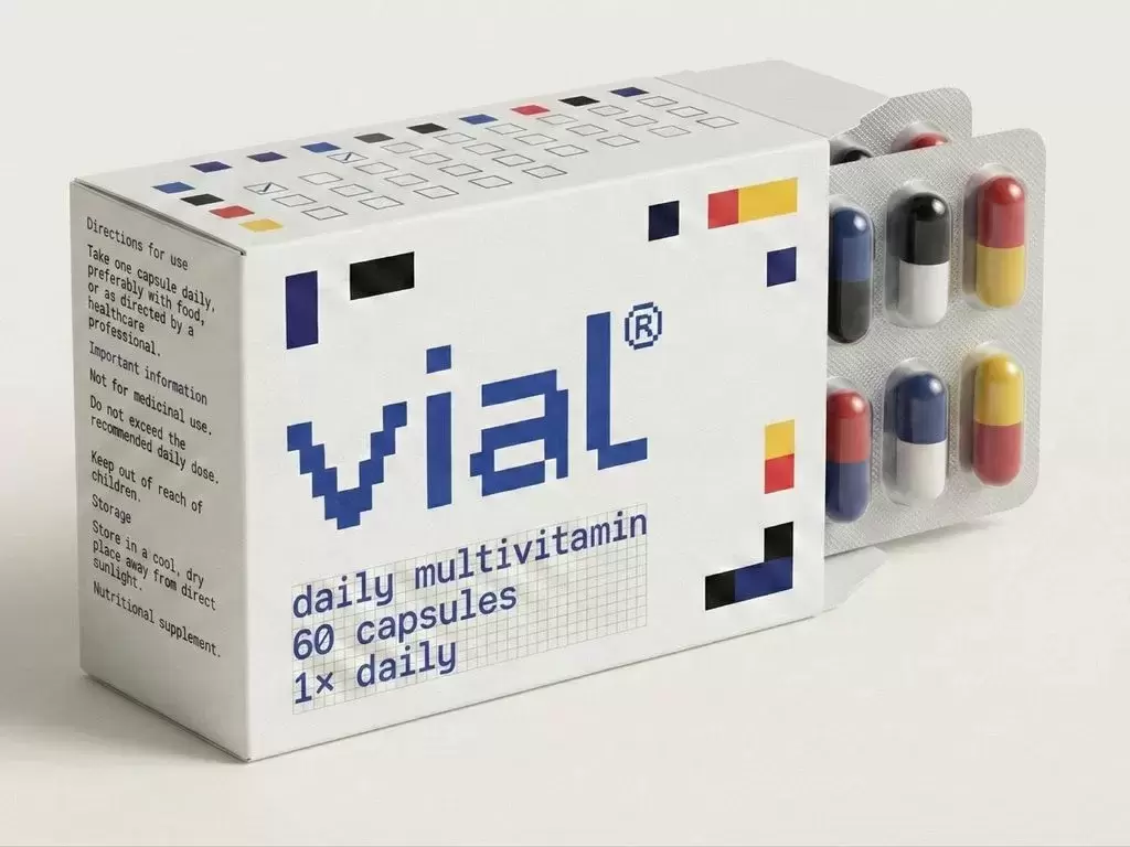
Indian design studio Presentable has developed Vial, a multivitamin packaging and identity concept that moves away from the clinical and urgency-driven visual language commonly used across the supplement category.
Instead of positioning vitamins as corrective products used in response to a deficiency or health concern, the system presents supplementation as part of a consistent everyday routine. The design combines restrained typography, modular graphics and information-led colour coding to create a quieter and more structured brand identity.
Modular grid becomes the core design system
The identity is built around a rational modular grid in which individual geometric units represent different nutrients. These elements combine to form larger compositions, reinforcing the idea that wellbeing depends on multiple interconnected factors rather than a single ingredient or dramatic intervention.
The same visual logic is used to construct the Vial logotype, creating consistency between the brand mark and the wider packaging system. The approach allows different products within the range to remain visually related while still being differentiated through colour and composition.
Colour operates as information rather than decoration
Each colour within the system corresponds to a particular nutrient, enabling consumers to distinguish formulations without relying on highly promotional graphics or exaggerated claims.
Typography is kept neutral and controlled, allowing ingredient information and hierarchy to remain clear. Solid geometric forms communicate stability, while deliberate irregularities and gaps introduce variation intended to reflect changing nutritional requirements and the complexity of the human body.
Packaging becomes part of the daily routine
One of the most functional elements of the project is the integration of checkboxes directly into the packaging. Consumers can mark each daily dose as it is taken, turning the pack from a passive container into an interface for tracking behaviour.
This feature is designed to encourage adherence through simple repetition rather than reminders based on urgency or fear. Progress becomes physically visible on the packaging as the product is consumed.
Design responds to changing wellness culture
Presentable developed the concept around the idea that supplements are increasingly kept permanently visible in homes, on bathroom counters and within daily routines rather than purchased only in response to specific health concerns.
This changes how packaging is experienced. A pack designed primarily to attract attention during a brief retail interaction may feel visually aggressive when it remains visible every day. Vial therefore uses a calmer visual language intended to integrate more naturally into domestic environments.
Modernist influences shape the identity
The design draws inspiration from modernist composition and modular systems, including the work of Piet Mondrian and the stacking logic associated with Tetris. Presentable also connects the project with India’s design history and the principle that individual elements should serve a clear functional purpose.
Rather than using decoration independently from function, graphics, colour, typography and interaction are designed as parts of the same underlying system.
Packaging moves closer to user experience design
Vial illustrates a wider shift in which consumer packaging increasingly combines branding, information design and behavioural features. For wellness products in particular, packaging can influence how consistently products are used as well as how they are perceived.
By integrating daily tracking into a coherent modular identity, the project demonstrates how structural and graphic design can extend packaging beyond shelf differentiation and turn it into an active component of the consumer experience.









Comments (0)